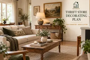
Budget Wall Decor Ideas That Make a Bigger Impact for Less
Houselyn Budget Decorating Guide
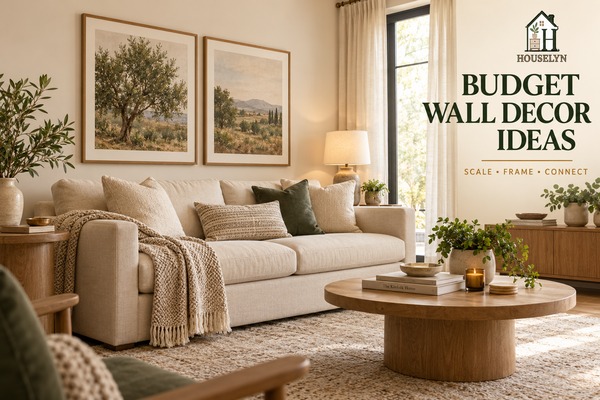
Budget wall decor ideas work best when you stop trying to fill every empty space and
start giving the wall the right amount of visual weight. A room can feel unfinished when
wall decor is too small, too scattered or disconnected from the furniture below it, even
when the individual pieces are attractive.
Affordable wall decor does not need to mean a collection of tiny prints, crowded shelves
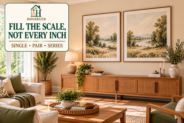
or several inexpensive pieces competing for attention. In many rooms, one larger framed
print, a balanced pair or a carefully spaced group can create more impact for less money.
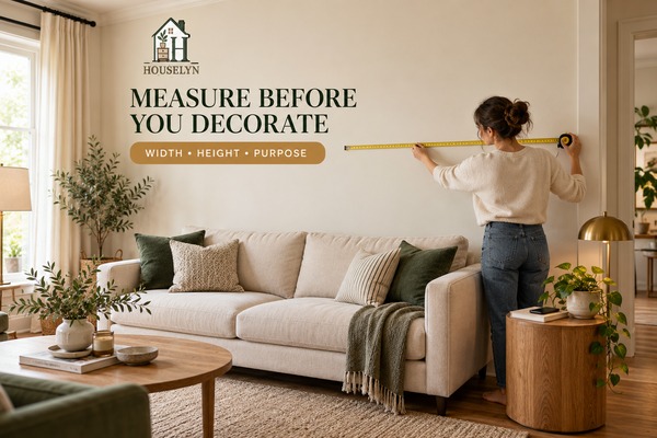
The strongest wall treatments begin with proportion. Measure the wall, identify the
furniture or architectural feature that should anchor the composition, then choose enough
scale to make the wall feel connected to the room.
Disclosure: Houselyn may earn a commission from qualifying purchases
made through selected affiliate links in this article, at no additional cost to you.
A larger, simpler wall treatment often looks more intentional than several small
inexpensive pieces spread across the same space.
Spend on Impact, Not Quantity
Affordable Wall Decor Looks Better When Scale Comes Before Shopping
A blank wall is not automatically asking for more objects. It may be asking for one
stronger visual decision. That distinction matters because wall decor often looks
inexpensive when the scale is too weak for the wall rather than because the individual
artwork cost too little.
Bigger Does Not Always Mean More Expensive
A large print in a simple frame may create more impact than several smaller pieces
bought separately.
Frames Add Structure
Consistent framing, matting and spacing can make affordable artwork feel deliberate
rather than temporary.
Blank Space Is Part of the Design
Leaving breathing room around wall decor helps scale, shape and placement read more
clearly.
The goal is not to cover the wall. It is to give the wall enough visual weight to feel
connected to the room.
Before buying anything, look at what sits beneath the wall. A sofa, console, bed or
dining table usually creates the strongest reference point for width and placement.
Wall decor that ignores that relationship can appear to float even when it is
technically centred on the wall.
Affordable wall decor becomes especially effective when a few decisions work together:
the scale is strong enough, the frames or materials repeat something in the room, the
spacing feels controlled and the composition stops before every available inch is
filled.
Chapter 1 — Start With the Wall
Start Budget Wall Decor Ideas With the Wall, Not the Artwork
The most effective affordable wall decor begins before you choose a print, mirror or
frame. Start by understanding the wall itself: how wide it is, what sits beneath it,
how much height is available and whether the wall should become a focal point or remain
a quieter supporting surface.
This step matters because wall decor is always read in context. A print that looks large
enough in a shop can appear undersized above a wide sofa. A narrow mirror may look
perfectly balanced over a compact console but disappear when placed on a broad empty wall.
Measure the usable wall and the furniture beneath it before choosing what to hang.
Scale becomes much easier to judge when the room sets the boundaries first.
Doors, windows, switches, radiators and nearby furniture can reduce the part of the wall
that is visually available for decorating. Measure the area you can actually use rather
than treating the full architectural width as the decorating zone.
This is especially important in smaller rooms, where wall decor can easily drift too
close to corners, curtains or adjacent furniture and make the space feel compressed.
Use the Furniture Below as Your First Anchor
In many rooms, the sofa, console, bed or dining table is a more useful reference point
than the wall edges. The wall decor should usually feel connected to the furniture group
beneath it rather than floating independently in the centre of the wall.
Photograph the wall straight-on before shopping. A simple reference image makes it
easier to judge whether a proposed piece is likely to feel too narrow, too tall or
visually disconnected.
Decide Whether the Wall Should Lead or Support
Not every wall needs to become a focal wall. If a fireplace, large window or strong piece
of furniture already dominates the room, another wall may only need a quieter treatment.
In a simpler room, one large artwork or mirror may be the element that provides the
missing visual weight.
Deciding that role before shopping protects the budget because it tells you whether you
need one strong piece, a balanced pair, a controlled grouping or very little at all.
Do Not Buy Several Small Pieces Before You Know the Total Scale
One of the easiest ways to overspend on a budget wall is to buy several inexpensive
pieces individually and hope they will create enough impact together. Often they do not,
and the total cost can exceed the price of one larger, simpler treatment.
Establish the total visual size first. Then decide whether that scale should come from
one piece, a pair or a grouped arrangement.
Keep Sightlines and Breathing Room in the Plan
Wall decor should not crowd nearby curtains, shelves, door frames or corners. Leaving
visible space around the composition helps it read as one deliberate treatment rather
than a collection that has expanded until no blank wall remains.
Once the wall brief is clear, the next decision is scale. Chapter 2 looks at why larger
visual impact often makes inexpensive wall decor feel more polished—and why several small
pieces can sometimes make a budget wall look more expensive in the wrong way.
Budget wall decor ideas usually look more polished when the treatment has enough
visual scale to relate to the wall and the furniture beneath it. A small print may be
inexpensive, but if it looks lost above a wide sofa, the wall can still feel unfinished.
Scale is one of the most important differences between wall decor that looks intentional
and wall decor that looks temporary. The goal is not necessarily to buy a physically
enormous piece. It is to create enough visual weight for the composition to hold its own
in the room.
One stronger wall treatment often gives a large furniture grouping more balance than
several undersized decorations spread across the same wall.
Why Small Wall Decor Often Looks More Expensive in the Wrong Way
Buying several inexpensive pieces can feel safer than committing to one larger treatment,
but those small purchases add up. If each piece is too weak for the available wall, the
result may cost more while still looking less resolved.
Before adding quantity, ask whether the existing artwork simply needs more presence.
Larger framing, a wider mat or a carefully chosen pair may solve the scale problem without
adding more decorative categories.
Relate the Artwork to the Furniture, Not the Empty Wall Around It
A broad sofa, console or bed creates a strong horizontal line. Wall decor placed above it
should usually feel substantial enough to belong to that furniture grouping. When the art
is dramatically narrower, the two elements can appear visually disconnected.
This does not require the artwork to match the furniture width. The goal is proportional
relationship rather than identical measurement.
Visual Weight Matters as Much as Physical Size
A piece with a substantial frame, strong contrast or generous mat can carry more visual
weight than a similarly sized frameless print. Two coordinated pieces may also read as one
larger composition when their spacing is controlled.
This is useful for affordable wall decor because scale can sometimes be built through
presentation rather than through a more expensive artwork purchase.
Use One Large Piece When Simplicity Gives You Better Value
One large framed print can be more economical than assembling several smaller frames,
mats and artworks. It can also be easier to position because the composition has one
clear centre and one clear relationship to the furniture below.
This approach works particularly well where the room already contains several textures,
furniture pieces or decorative objects and the wall needs calm rather than additional
detail.
Use a Pair When One Piece Feels Too Narrow
A balanced pair can create useful horizontal width while remaining visually calm. This
works well above consoles, sofas and beds where one narrow artwork would leave too much
disconnected wall on either side.
Keep the relationship obvious: similar frame treatment, related artwork or repeated
colour can help the two pieces read together rather than as separate decorations.
Do Not Solve Every Large Wall With a Gallery Wall
Gallery walls can be effective, but they are not automatically the cheapest or easiest
route to scale. Multiple frames, prints and hanging materials can quickly exceed the cost
of a simpler large treatment.
Choose a gallery wall because the room benefits from a layered composition, not because
you assume a large wall must be filled with many things.
Strong scale gives the wall presence. The next step is presentation. Chapter 3 focuses on
how framing, repetition and alignment can make inexpensive artwork feel more intentional
without requiring expensive originals.
Chapter 3 — Make Affordable Art Look Finished
Use Framing and Repetition to Make Affordable Wall Art Look Finished
Affordable wall decor can feel far more intentional when the presentation is
consistent. A simple print, photograph or personal piece does not need an expensive
origin to look polished; framing, matting, alignment and repetition can give it the
structure that makes the whole wall feel considered.
The goal is not to make inexpensive art pretend to be something it is not. The goal is
to remove the visual signals that make a wall feel temporary: mismatched proportions,
random spacing, inconsistent frame finishes and pieces that appear to have been hung one
at a time without a plan.
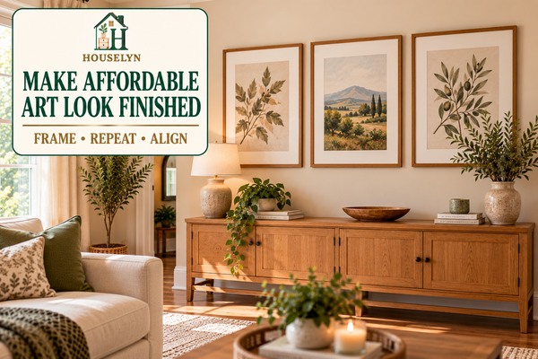
Consistent framing and spacing can make affordable prints read as one deliberate wall
treatment rather than several unrelated purchases.
A simple frame creates a defined edge between the artwork and the surrounding wall. That
boundary matters because it gives even a modest print a clearer visual presence.
Keep the frame proportional to both the artwork and the wall. Very heavy framing can
overpower a delicate print, while an extremely thin frame may not provide enough
structure for a larger composition.
Use Matting to Create Breathing Room
A mat can make a smaller image feel more substantial without requiring a larger or more
expensive print. It also creates visual separation between the artwork and frame, which
can make the finished piece feel calmer and more deliberate.
Consistent mat colour is especially useful when several affordable prints have different
colours or subjects. The repeated border can become the visual connection that holds the
group together.
Repeat One Element Instead of Matching Everything
Wall art does not need identical frames, identical subjects and identical sizes at the
same time. Too much matching can make the wall feel rigid.
Instead, choose one dominant point of consistency. That might be frame finish, mat colour,
print style, size or spacing.
Use Personal Photography or Meaningful Art With the Same Discipline
Family photographs, travel images, children's artwork and other personal pieces can
create more character than generic decor when they are presented deliberately.
Similar frames, consistent matting or a controlled colour treatment can help personal
artwork belong to the room rather than looking like a temporary display.
Keep the Frame Finish Connected to the Room
Natural wood frames can repeat furniture or flooring. A dark frame can connect with lamp
bases or other black details. A warmer metallic finish may work when a similar metal is
already present elsewhere.
The frame does not need to match every object. It only needs enough visual connection to
avoid feeling arbitrary.
Align the Group Before Adding Another Piece
When affordable art feels weak, the first instinct may be to buy another print. Check
alignment and spacing first. Two or three pieces can look substantially stronger when
their edges and gaps feel controlled.
More artwork should solve a scale problem, not compensate for weak presentation.
Once framing and repetition are under control, smaller pieces can be combined more
successfully. Chapter 4 focuses on building a budget gallery wall without allowing the
grouping to become crowded or expensive.
Create a Budget Gallery Wall With Fewer, Better-Placed Pieces
A gallery wall can solve a large wall without requiring one expensive artwork, but it
only saves money when the grouping is planned. Buying inexpensive frames and prints one
at a time can quickly create more cost, more holes and more visual noise than the wall
actually needs.
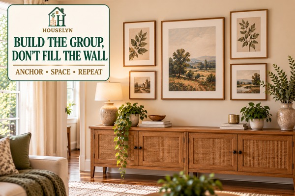
The strongest affordable gallery walls behave like one composition. They have an anchor,
repeated elements and enough breathing room for the eye to understand the group as a
whole instead of processing every frame as a separate decoration.
A smaller number of well-related frames can create stronger wall impact than a large
collection of inexpensive pieces added without a layout.
Choose the largest or visually strongest piece first. This gives the composition a centre
of gravity and makes it easier to judge how much additional artwork the wall really
needs.
The anchor does not have to sit in the mathematical centre of the arrangement. It simply
needs enough presence to stop the collection feeling like several small frames floating
independently.
Build Outward Instead of Filling Every Gap
Add supporting pieces around the anchor only where they improve balance. A gallery wall
should grow as one composition, not expand automatically until every open patch of wall
has been occupied.
This approach protects both the budget and the design. Every additional frame, print and
fixing should contribute enough to justify its cost.
Keep Spacing More Consistent Than the Artwork
Mixed sizes and subjects can work when the gaps between frames feel controlled. Uneven
spacing can make otherwise coordinated art appear accidental.
The exact distance matters less than consistency. Choose a gap that suits the frame sizes
and maintain it closely across the grouping.
Plan the Arrangement Before Making Holes
Lay frames on the floor first or create simple paper templates in the same dimensions.
This allows you to test the total width, height and spacing before committing to a wall
layout.
Planning is especially useful when frames vary in size because a layout that looks
balanced at floor level can be adjusted easily before hanging begins.
Mix Sizes Deliberately, Not Randomly
Variation can make a gallery wall more interesting, but every size should contribute to
the balance. A large frame can anchor several smaller ones, while two medium frames can
balance opposite sides of a stronger central piece.
If every frame is a different size without an obvious hierarchy, the eye has no clear
place to begin.
Leave a Border of Empty Wall Around the Group
The composition needs a visible edge. Allow enough blank wall around the grouping so it
does not collide visually with ceilings, corners, curtains or adjacent furniture.
This is the point where many gallery walls become more expensive than necessary: another
frame is purchased because a patch of wall remains empty even though the composition is
already balanced.
Gallery walls are only one way to create affordable scale. Chapter 5 looks at how larger
walls can often be handled more simply with one oversized treatment, a pair, a series,
a mirror or a shallow ledge.
Chapter 5 — Decorate Large Walls Without Overspending
Use Larger Wall Treatments Instead of Buying More Small Decor
Large walls often encourage unnecessary spending because they seem to demand more
objects. In reality, the wall usually needs more visual scale—not more individual
purchases. One strong treatment, a balanced pair or a simple series can make the space
feel finished without covering every available inch.
The most useful question is not, “How many things can I put here?” It is, “What is the
simplest treatment that gives this wall enough presence?” That shift keeps affordable
wall decor focused on impact rather than accumulation.
A large wall does not need to be completely covered. It needs enough visual weight to
feel connected to the room.
Large walls become expensive when several different treatments compete at the same time:
art, shelves, mirrors, decorative objects and additional frames all trying to solve the
same empty space.
Choose one dominant strategy first. A large framed print, pair, trio, mirror or shallow
ledge can provide enough structure on its own. Supporting details should remain secondary.
Use a Single Large Piece When the Room Already Has Detail
In a room with patterned textiles, layered furniture or several decorative objects, one
large artwork can give the wall presence without adding more visual complexity.
Large-scale does not have to mean expensive original art. A well-sized affordable print,
photograph or textile presented simply can create enough impact when the proportions are
right.
Use a Pair When the Wall Needs Width and Order
Two related pieces can stretch visually across a broad wall while keeping the composition
calm. This works well above consoles, sofas and beds where one narrow artwork might feel
too isolated.
Keep the relationship easy to understand through similar dimensions, frame finish,
subject matter or matting.
Use Mirrors Where They Add More Than Decoration
A mirror can be a useful budget wall treatment when it reflects light, supports a
functional zone or gives the wall enough scale. It should not be chosen only because the
wall is large.
Check what the mirror will actually reflect. A beautifully framed mirror that mainly
reflects clutter or an awkward doorway may not improve the room as much as expected.
Consider Texture When More Framed Art Would Feel Repetitive
A textile wall hanging or framed fabric can introduce softness and material variation on
a large wall. This can be useful in rooms that already contain several conventional
prints or photographs.
The same scale rules still apply. Texture does not compensate for a treatment that is too
small for the surrounding furniture.
Do Not Let a Picture Ledge Become Another Shelf to Fill
A ledge works best when it contains a controlled number of frames or objects. Once every
inch is layered with decor, the large wall problem returns in a different form.
Use overlap selectively, keep some wall visible and remove pieces when the display begins
to feel crowded.
Compare the Total Cost of the Whole Wall
A £10 or £15 decorative item may feel inexpensive, but several small purchases can quickly
exceed the cost of one larger frame, one mirror or a simple pair.
Budget decorating works best when you price the complete wall treatment rather than
judging each object separately.
Once the wall has enough scale, the next task is connection. Chapter 6 looks at how
affordable wall decor can repeat colour, material and shape from the room so the wall
feels integrated rather than added afterwards.
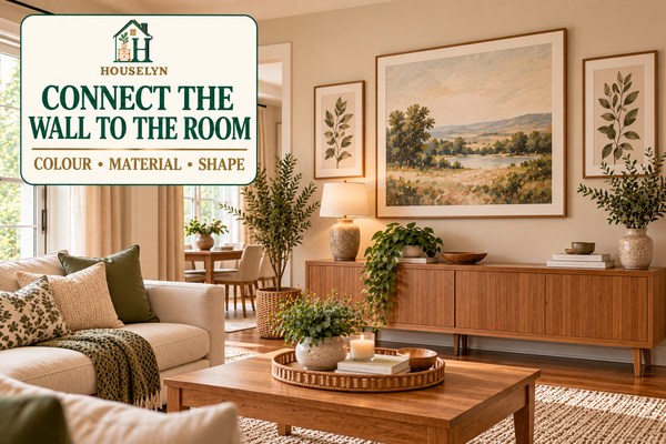
Repeat Colour, Material or Shape So the Wall Belongs to the Room
Budget wall decor looks more intentional when it connects visually to the furniture,
textiles and finishes already in the room. The wall does not need to match everything,
but it should feel like part of the same design rather than a separate collection added
afterwards.
This connection can be simple. A frame finish can repeat a wood tone from the furniture.
Artwork can pick up a muted colour from the rug or cushions. A round mirror can soften a
room filled with straight furniture lines.
Wall decor feels more deliberate when it repeats enough colour, material or shape for
the eye to understand why it belongs in the room.
Artwork can connect to a room by repeating one or two colours already present in cushions,
curtains, rugs or upholstery. The repetition does not need to be exact. A softer or deeper
version of the same colour family is often enough to create a relationship.
Avoid choosing art only because every colour matches the room. A little contrast keeps the
wall interesting. The goal is connection, not camouflage.
Let the Frame Repeat a Material Already in the Space
Natural wood frames can echo a console, coffee table or flooring. Dark frames can relate
to lamp bases or other black details. A warm metallic frame may work when similar metal
finishes appear elsewhere.
This is one of the simplest ways to make affordable wall decor feel integrated without
buying new furniture or accessories.
Use Shape to Balance the Furniture
Rooms with many straight edges can benefit from a round or softly curved mirror. A room
with rounded furniture may benefit from stronger rectangular artwork that adds structure.
Shape does not have to repeat literally. It can either echo what already exists or provide
a controlled contrast that improves balance.
Connect the Wall to the Furniture Below It
Scale is part of connection. Artwork that is visually unrelated to the sofa, console or
bed beneath it can still feel disconnected even when the colours are perfect.
Look at the entire composition from across the room. The furniture and wall treatment
should read as a related zone rather than two independent layers.
Use Repetition Sparingly
A room does not need the same colour repeated in every frame, cushion and accessory.
Repetition becomes more sophisticated when it appears in a few deliberate places.
If the art already repeats the rug colour and the frame relates to the furniture, the wall
may not need another matching decorative object underneath it.
Once the wall is connected to the room, the final skill is knowing when to stop. Chapter
7 focuses on editing, negative space and recognising when another frame or shelf would add
more visual noise than value.
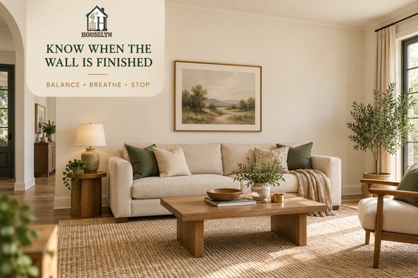
Stop Adding Wall Decor Once the Room Feels Balanced
One of the most important budget wall decor skills is knowing when not to buy another
frame, shelf or decorative object. A wall can be complete while still showing plenty of
blank space. In fact, that breathing room often helps the strongest pieces look more
intentional.
The mistake is assuming that every visible patch of wall represents an unfinished job.
Empty wall can separate focal points, protect proportions and give the eye somewhere to
rest.
A finished wall can still contain generous blank space. The goal is balance, not maximum
coverage.
Blank space helps define the edges of a composition. Without it, framed art, mirrors,
shelves and furniture can begin to compete rather than support one another.
Look at the wall from the main doorway or seating position. If the artwork already feels
anchored and the furniture group below it reads clearly, additional decor may weaken the
composition rather than improve it.
Protect Space Around Windows, Curtains and Corners
Wall decor that creeps too close to architectural edges can make a room feel tighter.
Leave enough visual separation around windows, curtain panels, door frames and corners so
each element can be read clearly.
This is especially important in smaller rooms, where a few inches of breathing room can
make the wall feel much calmer.
Do Not Let Every Wall Compete for Attention
A room may contain several available walls, but they do not all need the same visual
strength. If one wall already carries a major artwork, gallery grouping or mirror, the
surrounding walls can often be quieter.
Giving every wall a focal treatment creates competition and can make a room feel busier
than its actual square footage.
Edit Before You Shop Again
When a wall still feels wrong, adding another item should not be the automatic response.
First check whether something should move, come down or receive more breathing room.
A small adjustment in height, spacing or grouping can often solve the visual problem
without adding anything to the budget.
Remove Duplicate Visual Jobs
Two shelves, a mirror, framed art and decorative plates may all be attractive
individually, but together they may perform the same visual job: filling space.
Keep the treatment that contributes the strongest scale, function or character and let
weaker additions go.
Houselyn Principle: A Finished Wall Does Not Need to Be a Full Wall.
Completion comes from proportion, connection and balance—not from decorating every
available surface.
Use Restraint to Protect the Budget
Editing is one of the few decorating decisions that can improve the room while costing
nothing. It also prevents the slow accumulation of inexpensive wall pieces that eventually
cost more than one stronger treatment would have.
When the wall has a clear anchor, enough scale and a visible relationship to the room, let
it stop there.
With the wall measured, scaled, framed, grouped, connected and edited, the full Houselyn
framework is complete: Measure → Anchor → Scale → Group → Connect → Edit.
The next section turns those principles into a practical action plan and answers the most
common questions about decorating walls on a budget.
Budget Wall Decor FAQ
Common Questions About Decorating Walls on a Budget
Affordable wall decorating becomes easier when you treat scale, placement and
presentation as part of the purchase decision. These answers address the most common
problems that appear once you begin choosing art, frames, mirrors and grouped wall
treatments.
1. What Are the Best Budget Wall Decor Ideas?
The strongest budget wall decor ideas usually create enough visual impact without
requiring many separate purchases. Large affordable prints in simple frames, balanced
pairs, small coordinated series, mirrors used where they add function, personal
photography and restrained gallery walls can all work well. The best option depends on
the wall size, the furniture below it and the amount of visual detail already present
in the room.
2. How Can I Decorate a Blank Wall Cheaply?
Start by deciding what the wall needs rather than shopping immediately. Measure the
usable area, identify the furniture or architectural feature that should anchor the
treatment, then choose one clear strategy. A single larger framed print, pair of
coordinated frames or carefully planned gallery grouping may cost less than collecting
several unrelated small decorations.
3. How Do I Choose the Right Size Wall Art?
Judge artwork in relation to the furniture and wall zone around it. Art above a sofa,
bed or console should feel substantial enough to belong to that furniture grouping.
Before buying, record the furniture width and available wall width, then compare the
overall framed dimensions rather than the printed image alone.
4. How Wide Should Artwork Be Above a Sofa or Console?
There is no single width that works for every room because frame weight, furniture
shape and surrounding architecture affect the result. Use the sofa or console as the
visual anchor and choose artwork or a grouped composition that feels clearly related
to it rather than dramatically narrower. Testing the proposed dimensions with paper
templates can help before you commit.
5. How Can I Make Inexpensive Wall Art Look Better?
Improve the presentation before buying more artwork. Simple coordinated frames,
consistent matting, controlled spacing and stronger scale can make inexpensive prints
look much more deliberate. Connecting the frame finish or artwork colours to existing
materials in the room also helps the wall feel integrated.
6. Are Gallery Walls Still a Good Budget Option?
They can be, but only when the grouping is planned. A gallery wall becomes expensive
when frames and prints are purchased individually without a total layout. Begin with
an anchor piece, repeat at least one visual element, keep spacing controlled and stop
before the grouping expands simply because more wall remains visible.
7. How Many Pieces Should Be in a Gallery Wall?
Use the fewest pieces needed to create the required scale and balance. There is no
mandatory number. A group of three to five well-related frames may be more effective
than a much larger collection. The total composition should feel complete before the
wall feels full.
8. What Can I Put on a Large Wall Besides Artwork?
Depending on the room, a large mirror, textile wall hanging, framed fabric or shallow
picture ledge may provide enough scale. Choose a treatment because it improves the
room, not simply because it occupies wall space. Mirrors should reflect something
useful or attractive, while ledges should remain shallow enough to suit circulation
and furniture placement.
9. Are Mirrors Good Budget Wall Decor?
Mirrors can be effective when they provide both visual scale and a useful reflection.
They can help a wall feel finished while also reflecting daylight or supporting a
functional area. Before hanging one, check what it will reflect and make sure the wall
and fixing method are suitable for the mirror's size and weight.
10. How Do I Mix Different Frames Without Making the Wall Look Messy?
Give the frames one repeated connection. You might repeat the wood tone, mat colour,
frame thickness or artwork style while allowing another element to vary. Consistent
spacing also helps different frames read as one planned composition instead of a
random collection.
11. How High Should Wall Decor Be Hung?
Placement should relate to both the main viewing position and any furniture beneath
the artwork. Avoid hanging a piece so high that it loses connection with the sofa,
console or bed below. Rather than relying on one universal height, test the composition
in the actual room and judge whether the artwork feels visually anchored.
12. How Do I Know When a Wall Has Enough Decor?
Use the finished room as the test. If the wall has a clear focal point, enough scale,
a visible relationship to the furniture and deliberate breathing room, another object
may not improve it. A remaining blank area is not automatically a problem. Often,
negative space is what allows the existing wall decor to look confident.
Put the Strategy Into Practice
The Houselyn 5-Step Budget Wall Decor Plan
You do not need to redesign every wall at once. Use this five-step sequence on one wall
first, then repeat it elsewhere only when another wall genuinely needs attention.
1
Measure the Wall
Record the usable width, available height and width of the sofa, bed, console or
table beneath it. Note nearby doors, windows, curtains and architectural edges.
Goal: Define the real decorating zone before a purchase influences
the decision.
2
Choose the Anchor
Decide what should visually organise the wall. This may be the furniture below,
one larger artwork, a mirror or the strongest piece in a grouped arrangement.
Goal: Give the wall one clear point of visual organisation.
3
Build Enough Scale
Choose one larger treatment, a pair, a series or a controlled group that gives the
wall enough visual weight. Do not assume several small purchases will automatically
create better value.
Goal: Make the wall feel substantial before adding decorative
quantity.
4
Connect It to the Room
Repeat at least two useful visual relationships through colour, material or shape.
The connection can be subtle; the wall does not need to match every object in the
room.
Goal: Make the wall treatment feel like part of the interior
rather than an isolated purchase.
5
Edit Before Adding More
Step back and judge the whole room. Correct height, spacing or alignment before
shopping again, and protect enough negative space for the composition to remain
clear.
Goal: Finish the wall through balance, not maximum coverage.
Conclusion
Budget Wall Decor Ideas Work Best When Scale Comes Before Quantity
Budget wall decor ideas become far more effective when the goal is not to cover the
wall, but to make the wall feel connected to the room. That usually means measuring
first, relating the treatment to the furniture below, choosing enough scale, presenting
affordable art carefully and stopping before inexpensive additions turn into visual
clutter.
A successful wall does not reveal how much the artwork cost. What you notice first is
whether the scale feels right, whether the frames or materials belong in the room and
whether the composition has enough breathing space to be understood.
One large framed print may outperform six smaller purchases. A pair may create the
width a console needs. A small gallery grouping may work when its pieces behave as one
composition. A mirror may be worthwhile when it improves both the wall and the
reflection. The right solution depends on the room, but the decision process remains
consistent.
MEASURE → ANCHOR → SCALE → GROUP → CONNECT → EDIT
Measure the usable area. Anchor the composition to the room. Create enough scale before
increasing quantity. Group smaller pieces deliberately. Connect the wall through colour,
material or shape. Then edit until every remaining element has a reason to stay.
Continue Learning
Build the Rest of Your Budget Decorating Plan
Wall decor works best as part of a larger room strategy. Continue with these Houselyn
guides to make smarter decisions about spending, styling and affordable upgrades.
The Houselyn Editorial Team creates practical guides to home styling, interiors and
organization with an emphasis on realistic homes, better use of space and decorating
decisions that balance appearance, function and budget.
Discover practical budget decorating ideas for improving your home with better priorities, affordable upgrades, thrifted finds, wall decor and smarter styling.
Use a smarter thrift store decorating plan to find quality secondhand pieces, judge condition and value, avoid clutter and make thrifted decor look intentional.