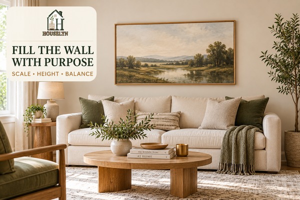
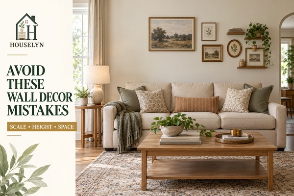
A large wall often looks more finished when the artwork relates to the furniture
beneath it and enough empty space remains around the composition.
Disclosure: Houselyn may earn a commission from qualifying purchases
made through selected affiliate links in this article, at no additional cost to you.
The hardest part of blank wall decor is rarely choosing a colour
or frame style. The more important decision is understanding how much visual weight
the wall needs and how that weight should relate to the sofa, console, fireplace or
other furniture beneath it.
Many blank wall decor ideas focus first on what to hang, but scale
and placement usually matter more than the object itself. A beautiful print that is
too small can look lost, while an attractive mirror hung too high can make the wall
feel disconnected from the furniture below.
Strong blank wall decor starts by treating the wall and furniture
as one visual zone. The art, mirror, shelves or grouped frames should feel as though
they belong to that zone rather than floating independently on a large empty surface.
This is especially important above a sofa. The sofa establishes a strong horizontal
line and usually becomes the main reference point for the blank wall decor
above it. The artwork or grouped composition should respond to that furniture width,
not simply to the full width of the wall.
A similar principle applies above consoles and sideboards. The wall treatment does
not need to match the furniture width exactly, but it should feel proportionate
enough that the two elements read as one connected arrangement.
Successful blank wall decor also depends on restraint. An empty wall
is not automatically an unfinished wall. Some rooms need one large artwork. Others
need a mirror, a small gallery, a picture ledge or no additional treatment at all.
The aim of this blank wall decor guide is therefore not to fill every
surface. It is to help you decide when a wall needs visual weight, what kind of
treatment suits it and how large and how high that treatment should be.
Why Blank Wall Decor Should Start With Proportion, Not Accessories
When blank wall decor feels wrong, the problem is often visible before
you can explain it. The artwork may appear too small, the grouping may sit too high,
or the wall treatment may be centred to the room when it should be centred to the
furniture.
This is why measuring comes before shopping. Wall width matters, but furniture width,
ceiling height, window placement, door openings and the amount of open wall around the
arrangement all affect the final result.
A well-planned blank wall decor composition creates a clear relationship
between the object on the wall and the furniture below it. That relationship makes the
whole seating area feel more deliberate.
The same logic helps prevent overdecorating. If one large piece creates enough balance,
adding several smaller pieces may weaken the result rather than improve it.
Use this sequence for blank wall decor: measure the available wall,
relate it to the furniture beneath it, choose the right wall treatment, size it
proportionately, position it at the right height, balance the surrounding negative
space and edit anything that makes the wall feel crowded.
Not Every Blank Wall Needs to Be Filled
One of the most useful blank wall decor ideas is sometimes to leave
the wall alone. A room with a strong fireplace, large window, dramatic curtain treatment
or substantial artwork elsewhere may already have enough visual activity.
Adding decor to every wall can make the room feel enclosed because the eye has nowhere
to rest. Good blank wall decor therefore considers the entire room,
not only the individual empty surface.
Negative wall space can also improve the impact of existing furniture and artwork.
When a wall treatment has enough room around it, the composition looks more deliberate
and the furniture beneath it remains visually important.
The Houselyn Principle
Relate the Wall Decor to the Furniture Before You Relate It to the Wall
The best blank wall decor usually belongs to a sofa, console,
fireplace or defined furniture grouping. Start with that relationship, then use the
remaining wall space as breathing room rather than as an area that must be filled.
Chapter 1 — Measure
Blank Wall Decor Starts With Measuring the Wall and the Furniture
Good blank wall decor starts before you choose artwork, a mirror
or shelves. The first job is to understand the usable wall, the furniture beneath
it and the architectural features that limit where anything can go.
Measuring the whole wall is useful, but it is not enough. Strong
blank wall decor depends on the part of the wall that is actually
available after you account for windows, doors, curtains, switches, vents, sconces
and nearby furniture.
Measuring both the wall and the furniture beneath it gives you a much more useful
starting point than wall width alone.
Measure from the real visual boundaries, not automatically from corner to corner.
A curtain stack, doorway, architectural recess or fireplace edge may reduce the area
that should be treated as one composition.
This matters because blank wall decor should sit inside a coherent
visual zone rather than stretching across architectural features that divide the room.
Measure the Furniture Beneath the Wall
If the wall sits above a sofa, console, sideboard or media unit, record that furniture
width before deciding how large the wall treatment should be.
Furniture measurement gives blank wall decor a meaningful reference.
The sofa or console often defines the visual zone more strongly than the full wall does.
Record the Furniture Height Too
Furniture height affects where a frame, mirror or ledge can begin. A tall console and
a low sofa create very different amounts of usable vertical space.
Accurate blank wall decor planning therefore considers both width
and height before any hanging position is chosen.
Check Ceiling Height Before You Assume the Wall Needs More
High ceilings can make ordinary-sized artwork appear smaller than expected, while a
low ceiling can make overly tall wall decor feel cramped.
Ceiling height should influence blank wall decor, but it should not
tempt you to fill the entire vertical surface. The furniture zone still needs to
remain the main reference point.
Identify Doors, Windows and Curtain Zones
Doors and windows create natural stopping points. Curtains also need enough side
clearance to stack and move without overlapping frames or shelves.
Some blank wall decor ideas look balanced only because the available
wall was defined correctly first. Treating a narrow section between a window and a
corner as though it belongs to the entire wall often leads to poor scale.
Mark Switches, Sockets, Thermostats and Sconces
Small wall features are easy to ignore during planning and frustrating to discover
after a frame layout has already been chosen.
Practical blank wall decor leaves these elements accessible and
avoids creating awkward visual collisions around them.
Measure From the Main Viewing Position
A wall can look balanced when viewed straight on but awkward from the sofa, doorway
or main entrance to the room. Step back and identify the angle from which the
composition will be seen most often.
Thoughtful blank wall decor accounts for the way the wall is actually
experienced, not only how it looks while standing directly in front of it.
Pay Extra Attention to Narrow Walls
Narrow walls often need one vertical piece, a slim mirror or a restrained sculptural
element rather than a miniature version of a wide gallery wall.
Narrow-wall blank wall decor usually looks stronger when the chosen
treatment follows the wall shape rather than trying to create horizontal width that
is not there.
Do Not Let the Largest Measurement Become the Target
A four-metre wall does not mean the decor should attempt to occupy most of four metres.
The relevant visual zone may be a two-metre sofa sitting within that wall.
This distinction keeps blank wall decor connected to the room instead
of turning it into a separate feature that overwhelms the furniture.
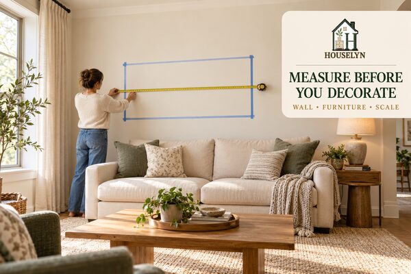
Use Painter's Tape Before You Commit
Once you have measurements, temporarily mark the expected outside dimensions of the
artwork, gallery grouping or mirror with low-tack tape. This makes scale much easier
to judge from across the room.
Testing proportions on the wall is one of the most useful
blank wall decor ideas because it lets you correct scale before
buying, drilling or hanging anything.
Once the wall, furniture and obstacles are recorded, blank wall decor
becomes much easier to plan. You are no longer choosing a frame for an abstract empty
wall; you are designing a composition for a specific furniture zone with known limits.
The next stage is to define that relationship more precisely by deciding what the wall
belongs to and whether the decor should align to the furniture, architectural feature
or wider room.
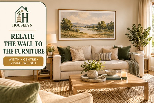
Relate Blank Wall Decor to the Furniture Beneath It
The most convincing blank wall decor usually looks connected to
the sofa, console, sideboard, fireplace or furniture grouping beneath it rather than
floating independently on a large wall.
Once the measurements are clear, the next question is simple: what does this wall
belong to? Strong blank wall decor has a visual relationship with
something else in the room.
Wall decor feels more intentional when its scale and centre relate directly to the
furniture beneath it.
A sofa creates a strong horizontal base, so the artwork above it should usually respond
to the sofa before it responds to the room's full wall width.
Sofa-based blank wall decor feels grounded when the art, mirror or
grouped composition is large enough to relate to that furniture width but still leaves
breathing room around the edges.
Use Furniture Width as a Starting Reference
For artwork or a grouped composition above furniture, testing a total width around
two-thirds to three-quarters of the furniture width can be a useful starting point.
It is not a fixed rule, and frame shape, room scale and visual weight can justify a
narrower or wider composition.
The value of this range is that it gives blank wall decor a practical
proportion test before style preferences take over.
Centre to the Furniture When the Furniture Owns the Wall
If a sofa sits off-centre on a much wider wall because of a doorway, reading zone or
window, centring the artwork to the entire wall can visually detach it from the sofa.
In that situation, blank wall decor usually feels more coherent when
its visual centre follows the furniture grouping rather than an architectural centre
that the room does not actually use.
Above a Console, Build One Vertical Composition
A console table, sideboard or narrow cabinet creates a smaller furniture zone than a
sofa. Art or a mirror above it should reinforce that zone instead of stretching
unnecessarily toward distant corners.
Console-based blank wall decor can feel especially polished when the
wall feature and tabletop styling read as one vertical composition.
Fireplaces Create Their Own Visual Centre
A fireplace is already an architectural anchor, so wall treatment above or beside it
should respect the fireplace proportions rather than borrowing the rules used above a
sofa.
Fireplace blank wall decor often requires more restraint because the
mantel, surround and hearth already contribute substantial visual detail.
Walls Without Furniture Need a Different Anchor
Some empty walls have no sofa, cabinet or fireplace beneath them. In that case, look
for another relationship: a reading chair, nearby doorway, floor lamp, corner plant or
the sightline from the main entrance.
These blank wall decor ideas work best when the wall still participates
in a clear room zone instead of becoming a decorative island with no connection to the
furniture plan.
Use Tape to Test the Furniture Relationship, Not Just the Wall
Once you know a possible artwork size, tape its outer boundary above the furniture and
step back to the normal viewing position. Look at the furniture and taped outline as
one composition.
This is more useful than judging blank wall decor from wall measurements
alone because the mock-up reveals whether the wall feature truly belongs to the
furniture beneath it.
Do Not Let Side Tables Distort the Main Centre
A sofa may be accompanied by side tables, lamps or plants, but the wall composition
does not always need to include their full width. Use the principal furniture grouping
as the dominant reference, then allow secondary pieces to balance the edges.
Balance Visual Weight, Not Only Centimetres
Two artworks with identical dimensions can feel different because one has a heavy dark
frame while the other is pale and visually quiet. A mirror with a thick frame may also
carry more visual weight than a frameless piece of the same width.
Refined blank wall decor therefore balances apparent weight as well
as physical measurement.
Check the Relationship From More Than One Seat
A composition may line up perfectly when standing in the centre of the room but feel
disconnected from an adjacent chair or the main doorway. Check several normal views
before committing to the final placement.
This kind of testing keeps blank wall decor connected to the room
rather than to one carefully staged viewing angle.
Once blank wall decor has a clear relationship to the furniture,
choosing the actual wall treatment becomes easier. You can now judge whether the zone
needs one oversized piece, a mirror, grouped frames, a ledge, shelves or intentional
empty space.
The next chapter focuses on that choice and shows how different wall treatments solve
different design problems without turning every empty wall into the same gallery display.
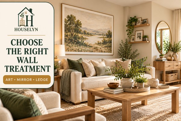
Chapter 3 — Choose
Choose the Right Type of Blank Wall Decor Before You Choose the Style
Strong blank wall decor begins by deciding what kind of treatment
the wall actually needs. A large artwork, mirror, gallery wall and floating shelf
solve different problems, so the format should come before the colour or frame style.
Once the wall and furniture relationship is clear, resist the temptation to start
shopping immediately. Better blank wall decor comes from matching the
treatment type to the purpose of the wall.
The best wall treatment depends on whether the room needs a focal point, reflected
light, flexible display space or simply more visual restraint.
Choose One Oversized Artwork When the Room Needs Calm
One large artwork is often the simplest way to give a wide wall enough visual weight
without introducing many separate frames or decorative objects.
Oversized blank wall decor can work especially well above a sofa
because the larger format creates one clear focal point and reduces the need for
several smaller pieces.
Use an Art Pair When You Want Structure Without a Gallery Wall
Two coordinated frames can provide more width than one narrow artwork while keeping
the composition easy to read.
Paired blank wall decor works best when the spacing between the two
pieces is controlled so the pair reads as one composition rather than two unrelated
pictures.
Choose a Trio for a Long Horizontal Zone
Three related frames can work above a wider sofa, console or sideboard when one
oversized piece is difficult to source or when the room benefits from a more rhythmic
arrangement.
A trio should still behave as one blank wall decor group. Keep the
frame sizes, spacing and overall visual footprint coordinated.
Use a Gallery Wall When the Room Needs Collected Character
A gallery wall can bring personality to a living room, but it needs a defined outer
boundary. Without one, the grouping can gradually spread across the wall and lose
visual discipline.
Gallery-based blank wall decor works best when the complete group is
planned as one shape before individual frames are positioned.
Choose a Mirror When the Wall Needs Light or Depth
A mirror can reflect daylight, repeat an attractive view and create a stronger sense
of depth, particularly in compact living rooms.
Mirror-based blank wall decor should still be judged by scale and
placement. A small mirror floating over a wide console can look just as disconnected
as undersized artwork.
Use Picture Ledges When You Want a Flexible Display
A picture ledge lets frames overlap slightly and makes it easier to update artwork
without creating a new hole for every change.
Ledge-based blank wall decor is especially useful for people who like
to rotate photographs, prints or seasonal artwork but still want the display to remain
contained.
Use Floating Shelves Only When the Wall Needs Depth
Shelves add three-dimensional depth and can support framed art, books, small objects
and greenery. That flexibility is useful, but it also creates more opportunities for
clutter.
Shelf-based blank wall decor should therefore be edited more strictly
than a single artwork. The shelf itself is already a visual element before anything
is placed on it.
Choose Textile Wall Decor When the Room Needs Softness
A woven textile, framed fabric or restrained wall hanging can soften a room dominated
by hard surfaces, but the piece still needs to be scaled to the furniture below it.
Textile blank wall decor is most effective when it contributes texture
without becoming so large or loose that it overwhelms the furniture zone.
Use Sculptural Wall Objects Sparingly
Sculptural wall pieces can introduce shape and shadow that flat artwork cannot, but
several small sculptural objects can quickly create visual noise.
Sculptural blank wall decor usually looks stronger when one substantial
form or one controlled grouping is allowed to lead.
Do Not Default to a Gallery Wall
A gallery wall is only one solution. On a visually busy sofa wall, one large artwork
may feel calmer. On a narrow wall, one vertical mirror may fit better. On a wall with
strong architecture, doing less may be the stronger decision.
The best blank wall decor ideas solve the actual problem of the wall
rather than repeating the same treatment in every room.
Let the Room Tell You How Much Variety It Needs
If the room already contains patterned curtains, a textured rug, open shelving and
several decorative accessories, the wall may need a simpler treatment. In a minimal
room, the wall may be able to carry more visual character.
Balanced blank wall decor responds to the amount of visual information
already present elsewhere in the room.
Once the treatment type is decided, blank wall decor becomes a scale
problem rather than an open-ended decorating problem. You know whether you are sizing
one artwork, a pair, a mirror, a gallery footprint or a shelf arrangement.
The next chapter focuses on that scale and shows how to judge wall decor against the
sofa, console and wider room without relying on wall width alone.
Chapter 4 — Size
Size Blank Wall Decor to the Furniture, Not Just the Empty Wall
The most common scale problem in blank wall decor is choosing
something that looks large in isolation but becomes visually small once it is hung
above a sofa, console or other substantial furniture.
Wall dimensions matter, but the furniture beneath the composition usually gives
blank wall decor its most useful scale reference. The goal is to
create enough visual weight that the wall treatment and furniture read as one zone.
Artwork should usually feel substantial enough to relate to the sofa beneath it
while still leaving clear wall around the composition.
If artwork is going above a sofa or console, measure that furniture first. Then use
the full wall as a secondary check for margins and breathing space.
This keeps blank wall decor from becoming visually detached from
the furniture simply because the architectural wall is much wider.
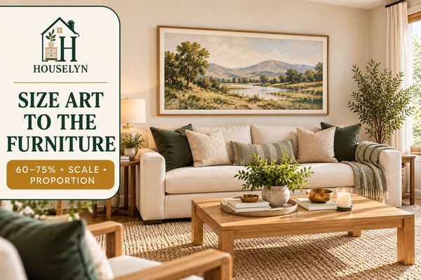
Test Roughly 60–75% of the Furniture Width
For a single artwork or grouped composition above furniture, a total width around
60–75% of the furniture width can be a useful planning range to test. It is not a
universal rule, and visual weight, frame shape, furniture proportions and room scale
may justify something outside that range.
The purpose of this range is to give blank wall decor a realistic
starting size before you make a final judgement from across the room.
Above a Sofa, Small Art Often Looks Smaller Than Expected
A framed print that looks substantial in a shop can appear undersized above a
three-seat sofa because the sofa creates a much stronger horizontal line.
Sofa-based blank wall decor therefore benefits from testing the
complete frame width against the sofa rather than judging the artwork by itself.
Treat an Art Pair as One Combined Width
When two frames are used together, measure from the outside edge of the first frame
to the outside edge of the second, including the gap between them.
Paired blank wall decor should be evaluated as one composition
because that complete footprint is what the eye reads from across the room.
Use the Same Principle for a Triptych
Three panels should not be sized independently. The total outside width, including
controlled spacing between panels, needs to relate to the furniture below.
Triptych blank wall decor can provide strong horizontal scale without
the visual complexity of a larger gallery wall.
Measure the Entire Gallery Wall Footprint
A gallery wall is one composition even though it contains several frames. Plan its
outer boundary first and keep each individual piece inside that boundary.
Gallery-style blank wall decor feels more controlled when the total
footprint has been sized to the furniture before individual frame positions are refined.
Situation
Useful Starting Test
Main Check
Art above a sofa
Test approximately 60–75% of sofa width
Does the artwork feel substantial without overpowering the sofa?
Art above a console
Test approximately 60–75% of console width
Does the wall feature and console read as one vertical composition?
Art pair
Measure both frames plus the gap as one width
Does the pair read as one unit?
Triptych
Measure the entire three-panel composition
Are panel gaps controlled enough to preserve one visual group?
Gallery wall
Plan the total outer footprint before individual frames
Does the group remain inside a clear boundary?
Mirror above console
Often narrower than the furniture, depending on mirror shape and frame weight
Does it feel connected without becoming too dominant?
Narrow wall
Test one vertical artwork or slim mirror
Does the decor follow the wall's vertical shape?
Large blank wall
Test one oversized piece or one controlled grouped composition
Is there enough scale without filling the wall edge to edge?
These are planning ranges and visual tests, not fixed design rules. Final sizing
should respond to frame weight, furniture scale, ceiling height and the wider room.
Mirrors Need Scale, but They Carry Different Visual Weight
Mirrors reflect the room, light and movement, so they can feel visually stronger than
similarly sized artwork. A thick or dark frame increases that weight further.
Mirror-based blank wall decor may therefore need to be slightly
narrower than a piece of artwork above the same furniture while still feeling clearly
connected to it.
Oversized Art Can Be Simpler Than Several Small Frames
A wide wall does not automatically require many pieces. One large artwork can create
enough scale while keeping the room calmer than an extensive gallery wall.
Large-format blank wall decor works particularly well when the room
already contains patterned textiles, bookshelves or several other decorative layers.
Small Rooms Still Need Properly Scaled Art
Choosing very small artwork does not necessarily make a compact room feel larger.
Several undersized pieces can introduce more visual fragmentation than one properly
scaled composition.
Small-room blank wall decor often benefits from fewer pieces with
enough presence to anchor the furniture cleanly.
Large Walls Need Scale, Not Automatic Coverage
A large wall may require a substantial artwork, but substantial does not mean wall-to-wall.
Margins are what allow the composition to read clearly.
This is why effective blank wall decor ideas distinguish between
filling a visual zone and filling the architectural wall.
Test Size With Tape Before Buying
Mark the proposed artwork or gallery dimensions on the wall with low-tack tape, then
look from the main seating position. If the taped footprint feels timid, the final
artwork will probably feel timid too.
This simple test improves blank wall decor because it lets you assess
the scale in the actual room rather than relying on product photos or measurements alone.
Once blank wall decor has the right overall size, placement becomes
much easier to judge. The composition has enough visual presence to connect with the
furniture, so the next task is deciding exactly how high it should sit.
The next chapter focuses on hanging height, furniture-to-frame spacing, eye level,
mirrors and shelves so properly sized decor does not end up floating too high on the wall.
Position Wall Art, Mirrors and Shelves at the Right Height
Well-sized blank wall decor can still feel disconnected if it is
positioned too high, too low or too far from the furniture beneath it. Placement
determines whether the wall treatment reads as part of the room or as something
floating above it.
Once scale is correct, height becomes the next major decision. Strong
blank wall decor should feel visually connected to the sofa, console,
sideboard or other anchor without appearing cramped against it.
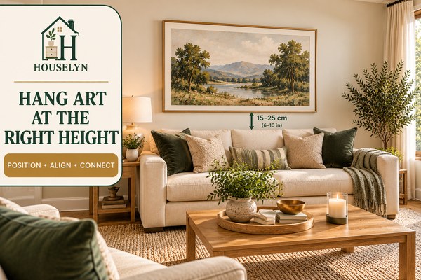
Correct hanging height helps artwork feel connected to the furniture instead of
floating independently on the wall.
Above a sofa, console or sideboard, the lower edge of the artwork should feel close
enough to belong to the furniture zone. If the gap becomes too large, the eye starts
reading the two elements separately.
For many layouts, testing a gap of roughly 15–25 cm (6–10 in) above the furniture
can be a useful starting point for blank wall decor. Frame size,
furniture height and room scale may justify an adjustment.
Use the Gap as a Starting Test, Not a Fixed Rule
A low sofa with tall artwork may need a slightly different relationship from a tall
console with a compact mirror. The visual connection matters more than achieving one
universal measurement.
This is why blank wall decor should be tested from the main viewing
position before any final fixing point is committed.
Do Not Default to Eye Level Without Considering Furniture
General eye-level guidance can be useful on an open wall, but art above furniture is
part of a larger composition. Positioning it solely according to standing eye level
can push it too far away from the sofa or console.
Furniture-based blank wall decor should prioritise the relationship
between the lower edge of the wall treatment and the furniture below.
Keep the Visual Centre Comfortable
When artwork is not above furniture, its centre should usually sit in a comfortable
viewing zone rather than near the ceiling. Room proportions, viewer height and the
surrounding architecture all influence the final position.
The aim of blank wall decor is not to place everything at exactly the
same height throughout the home. It is to make each composition feel visually grounded.
Gallery Walls Need One Shared Visual Centre
A gallery wall should be positioned as one composition rather than hanging each frame
according to its own individual eye level.
Gallery-style blank wall decor feels more coherent when the complete
outer footprint sits at the right height relative to the sofa or console below.
Mirrors Should Connect to the Furniture Without Feeling Compressed
A mirror above a console should not float near the ceiling, but it also needs enough
separation from tabletop lamps, flowers and accessories to prevent visual crowding.
Mirror-based blank wall decor works best when the mirror and console
form one vertical arrangement with intentional space between them.
Check the Wall Type Before Choosing the Fixing
Plasterboard, masonry and other wall constructions can require different fixings.
Always match the hanging hardware to the wall type and the manufacturer's stated
weight requirements rather than assuming one hook suits every installation.
Safe blank wall decor depends on secure installation as much as
visual placement, particularly for mirrors and heavier framed pieces.
Picture Ledges Should Feel Connected to the Furniture
A picture ledge creates a strong horizontal line, so its position should relate clearly
to the sofa, console or wall zone beneath it.
Ledge-based blank wall decor should not be pushed upward simply to
occupy more wall. A slightly lower position often creates a stronger relationship
with the furniture and makes the displayed objects easier to read.
Floating Shelves Need Enough Vertical Breathing Room
If several shelves are used, allow enough vertical spacing for the objects on each
shelf. Closely stacked shelves can make the entire wall feel visually dense.
Shelf-based blank wall decor works best when the shelves and the
objects on them still leave recognisable wall space between the layers.
Tall Ceilings Do Not Mean the Art Should Move Up
A high ceiling creates more wall above the composition, but that does not automatically
mean the artwork should be raised to fill it.
Tall-room blank wall decor should still connect to the furniture
zone. If additional vertical scale is needed, a taller artwork or larger grouping is
often more coherent than simply moving an undersized frame upward.
Use Temporary Paper Templates for Multi-Frame Layouts
For an art pair, trio or gallery wall, cut paper to the approximate frame sizes and
tape the templates to the wall before installing hardware. This makes spacing and
height easier to evaluate from a distance.
These kinds of blank wall decor ideas are particularly useful when
several frames must share one visual centre and consistent outer boundary.
Once blank wall decor is correctly sized and positioned, the wall
should feel connected rather than filled. The furniture remains part of the composition,
the artwork sits in a comfortable viewing zone and enough wall remains visible around it.
The next chapter focuses on that remaining space and explains how negative space keeps
a decorated wall from becoming visually heavy, crowded or overworked.
Chapter 6 — Balance
Balance Blank Wall Decor With Negative Space
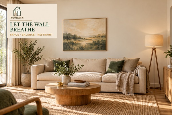
Strong blank wall decor needs enough empty wall around it to remain
readable. Negative space is not leftover space; it is part of the composition and
helps the artwork, mirror or shelves feel deliberate instead of crowded.
Once a wall treatment has the right size and height, the temptation is to keep adding.
Better blank wall decor usually comes from protecting the margins
around the composition rather than trying to use every remaining area.
Clear wall around the composition helps the artwork feel more important while
preventing the room from becoming visually crowded.
Artwork needs visible wall around it to establish a boundary. If a frame or gallery
grouping sits too close to curtains, corners, ceiling lines or neighbouring decor,
the composition can lose clarity.
Balanced blank wall decor allows the eye to recognise where the
display begins and ends.
Do Not Fill the Wall Edge to Edge
Even on a very wide wall, visual weight is usually more important than total coverage.
A substantial artwork or controlled grouping can anchor the space while still leaving
generous wall visible on either side.
Large-scale blank wall decor should feel confident, not exhaustive.
The goal is to occupy the correct visual zone rather than every available centimetre.
Let the Ceiling Have Breathing Room
Tall frames and gallery walls still need separation from the ceiling. When the top of
the composition sits too close to the ceiling line, the wall can feel compressed.
Vertical blank wall decor works best when enough wall remains above
the display for the composition to feel intentional rather than forced into the space.
Keep Wall Decor From Competing With Curtains
Full curtains already create strong vertical lines, texture and visual weight. Art
placed too close to them can make both elements feel cramped.
Good blank wall decor respects the visual footprint of the curtain
stack instead of treating the wall behind it as fully available.
Balance Nearby Lamps, Plants and Furniture
Floor lamps, tall plants and table lamps contribute visual height beside a wall
composition. They do not need to be included inside the artwork width, but they do
affect the overall balance of the wall zone.
This is why blank wall decor should be judged in the finished room,
not only while the wall is empty.
Not Every Wall Should Become a Feature Wall
If one wall already contains the room's main artwork, another wall may need very
little. Repeating large displays on every visible surface can make the room feel
visually restless.
Intentional blank wall decor includes knowing when one wall should
lead and another should remain quiet.
Small Rooms Often Benefit From Fewer Decorated Walls
In compact living rooms, several decorated walls can create the feeling that the room
is closing inward. One strong composition may be enough to establish character.
Small-space blank wall decor often looks more spacious when some
walls are deliberately left simpler.
Balance Heavy Visual Weight With Simpler Neighbouring Areas
A dark oversized artwork, dense gallery wall or heavily framed mirror carries more
visual weight than a pale print of the same physical dimensions.
When blank wall decor is visually heavy, the surrounding areas often
need to be quieter so the room does not feel overloaded.
Do Not Decorate Around Every Empty Gap
Small gaps between a frame and nearby furniture do not automatically need a sconce,
tiny artwork or hanging ornament. Filling those spaces can weaken the main composition.
Refined blank wall decor lets the main treatment have enough authority
that small empty areas can remain empty.
Open-Plan Rooms Need Controlled Visual Competition
In an open-plan living area, several walls may be visible at the same time. If each
one has a strong gallery, mirror or shelf display, none of them may feel dominant.
Open-plan blank wall decor benefits from choosing one or two important
wall moments and letting secondary areas remain restrained.
Use Negative Space to Make Small Artwork Feel More Deliberate
Smaller artwork can still work when it is intentionally positioned within a narrow
wall or compact furniture zone. Problems arise when it appears small only because the
surrounding wall is too large for it.
Some of the strongest blank wall decor ideas use empty wall as a
framing device rather than treating emptiness as something to eliminate.
Once blank wall decor has enough breathing room, the room should feel
calmer rather than emptier. The wall treatment has a clear boundary, the furniture
remains connected to it and the surrounding architecture can still be seen.
The next chapter applies the framework to specific wall shapes and difficult situations,
including large walls, narrow walls, high walls, spaces between windows and walls
behind sectionals.
Chapter 7 — Wall Types
Blank Wall Decor Solutions for Large, Narrow and Awkward Walls
Different wall shapes need different blank wall decor strategies.
A wide wall behind a sectional, a narrow strip between windows and a tall wall under
a high ceiling should not be treated as though they offer the same proportions.
The shape of the wall is a design clue. Strong blank wall decor
follows that geometry instead of forcing the same artwork arrangement into every
available space.
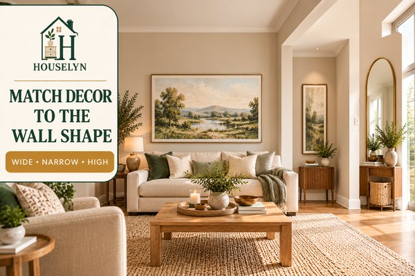
Wide, narrow and high walls become easier to decorate when the wall treatment follows
the proportions of the space rather than a one-size-fits-all layout.
Large Blank Walls Need Scale Before They Need More Objects
A large wall often creates the impression that many decorative pieces are required,
but one substantial artwork or one controlled grouping may solve the problem more
effectively.
Large-wall blank wall decor should create enough visual weight to
anchor the furniture zone while preserving clear wall around the composition.
Do Not Spread Small Frames Across a Large Wall
Several small frames positioned far apart can make a wide wall feel even emptier
because the eye reads each piece separately.
Better blank wall decor groups smaller frames inside one defined
footprint so the complete arrangement has enough presence.
Narrow Walls Usually Need Vertical Solutions
A narrow wall beside a fireplace, doorway or window rarely needs a small horizontal
gallery arrangement. A vertical artwork, slim mirror or narrow sculptural feature
usually follows the proportions more naturally.
Narrow-wall blank wall decor looks stronger when the treatment
reinforces the wall's height rather than fighting for width that is not available.
Walls Between Windows Need Restraint
The area between two windows already has strong vertical boundaries, so one centred
artwork or slim mirror may be enough.
Between-window blank wall decor should not compete with curtain
panels or make the space between openings feel overcrowded.
Walls Beside a Fireplace Should Support the Fireplace
A fireplace already creates a dominant architectural feature. Adjacent wall decor
should either support that focal point or establish a clearly separate furniture zone.
Fireplace-adjacent blank wall decor often benefits from lower visual
weight so the fireplace remains the dominant architectural anchor.
High Walls Need Taller Scale, Not Higher Hanging
A tall ceiling can make standard-size artwork feel undersized. The solution is often
to increase the height or total footprint of the composition rather than move a small
frame upward.
High-ceiling blank wall decor should still remain visually connected
to the furniture beneath it even when additional vertical scale is needed.
Low Ceilings Benefit From Controlled Vertical Space
In a low-ceiling room, very tall frames or stacked shelves can make the available wall
feel compressed. A wider horizontal piece may create better proportion.
Low-room blank wall decor should preserve visible space above the
composition so the ceiling does not feel visually lower.
Walls Behind Sectionals Need a Furniture-Zone Centre
A sectional can create an asymmetrical seating zone, especially when one side extends
into a chaise. The artwork does not always need to align with the full wall or even
the entire sectional footprint.
Sectional-based blank wall decor should usually relate to the main
seated area and the visual centre of the furniture grouping.
Open-Plan Walls Need a Clear Room-Zone Identity
In open-plan spaces, one long wall may pass through living, dining and circulation
zones. Treating the entire wall as one decorative surface can blur those functions.
Open-plan blank wall decor works better when each composition belongs
clearly to one furniture zone and enough empty wall separates it from the next.
Corner-Adjacent Walls Need Enough Edge Clearance
Artwork positioned very close to a corner can feel squeezed even if it is technically
centred above the furniture. Check the remaining wall margin before committing.
Corner-area blank wall decor often improves when the artwork is
slightly narrower or the whole furniture grouping shifts enough to restore breathing room.
Awkward Recesses Often Need Less, Not More
Recessed walls, shallow alcoves and irregular architectural sections can tempt you to
add shelves, multiple frames and small accessories simply because the space feels unusual.
Some of the strongest blank wall decor ideas for awkward walls use
one correctly scaled artwork, one mirror or intentional emptiness rather than many
small solutions competing for attention.
Let Existing Architecture Do Some of the Decorating
Mouldings, alcoves, brickwork, panelling and fireplaces already create shadow, texture
and structure. These features reduce how much additional decoration may be necessary.
Architecture-aware blank wall decor supports those features rather
than covering or competing with them.
Once blank wall decor responds correctly to the shape of the wall,
even awkward spaces become easier to solve. The treatment gains a clear boundary and
the architecture begins helping rather than fighting the composition.
The final chapter turns the complete system into a diagnostic check by identifying
the mistakes that most often make wall decor look undersized, disconnected, crowded
or unnecessarily complicated.
Blank Wall Decor Mistakes That Make a Living Room Feel Unbalanced
Most blank wall decor problems are caused by scale, placement,
spacing or visual competition rather than by choosing the wrong decorating style.
Fixing those structural issues usually creates a bigger improvement than buying
another frame or accessory.
Before replacing artwork, mirrors or shelves, look at the relationship between the
wall treatment and the furniture beneath it. Strong blank wall decor
should feel connected, correctly scaled and surrounded by enough wall to remain clear.
Undersized art, excessive height and crowded spacing can make an otherwise attractive
living-room wall feel disconnected from the furniture.
Small artwork can look attractive by itself but disappear once it is placed above a
wide sofa or substantial console. The surrounding furniture creates the scale reference.
Better blank wall decor starts by testing the complete artwork or
group footprint against the furniture beneath it.
2. Hanging Artwork Too High
A large gap between the furniture and artwork can make the frame appear to float in
the upper part of the wall.
Connected blank wall decor keeps enough separation for breathing
room while maintaining an obvious visual relationship with the furniture.
3. Centring the Decor to the Wall Instead of the Furniture
A sofa may sit off-centre because of a doorway, window or room layout. If the artwork
is then centred to the full wall, the two elements can feel unrelated.
Furniture-led blank wall decor often works better when its centre
follows the furniture zone that visually owns the wall.
4. Scattering Too Many Tiny Frames
Several small frames spread across a large wall create many weak focal points rather
than one strong composition.
Grouped blank wall decor should create a clear outer footprint so
the eye reads the display as one unit.
Artwork Too SmallThe furniture overwhelms the wall treatment and the wall still feels unfinished.
Artwork Too HighThe display floats away from the sofa, console or sideboard beneath it.
Wrong CentreThe art aligns to the architectural wall instead of the furniture grouping.
Tiny Scattered FramesThe eye processes several unrelated objects instead of one composition.
No Negative SpaceFrames, shelves and nearby features visually collide with one another.
Decorating Every WallThe room loses visual rest because every surface competes for attention.
5. Building a Gallery Wall Without an Outer Boundary
A gallery wall should be planned as one complete shape before individual frames are
installed. Adding frames gradually without a boundary often leads to an arrangement
that spreads too far.
Gallery-style blank wall decor feels more intentional when the entire
footprint is sized and positioned first.
6. Choosing a Mirror That Is Too Small
A small mirror above a wide console can look decorative but disconnected. Its reflective
surface may even make the lack of scale more noticeable.
Mirror-based blank wall decor still needs enough width and visual
weight to relate clearly to the furniture beneath it.
7. Overloading Floating Shelves
Shelves already add horizontal lines and depth to the wall. Covering them with many
frames, books, plants and ornaments can make the display heavy very quickly.
Shelf-based blank wall decor benefits from fewer objects, deliberate
spacing and visible wall between shelf levels.
8. Pushing the Composition Too Close to the Ceiling
High ceilings can tempt you to move wall decor upward, but that often weakens the
connection with the furniture below.
Tall-room blank wall decor usually improves by increasing the
composition's scale rather than simply increasing its hanging height.
9. Leaving No Clear Space Around the Display
Frames placed close to curtains, corners, ceilings, lamps or neighbouring shelves can
make the entire wall feel crowded even when each individual piece is attractive.
Refined blank wall decor uses negative space to establish a clear
beginning and end to the composition.
10. Mixing Too Many Frame Styles at Once
Mixing finishes can create a collected look, but too many unrelated colours, profiles
and materials can become visually noisy.
Controlled blank wall decor usually benefits from one dominant frame
language with limited variation rather than every frame demanding separate attention.
11. Ignoring Furniture Width
Choosing artwork only from wall measurements can create a composition that technically
fits the wall but looks wrong above the furniture.
Furniture width gives blank wall decor the proportion reference that
architectural wall width alone cannot provide.
12. Decorating Every Empty Wall
An undecorated wall is not necessarily a design problem. Some walls should remain
quieter so stronger focal points elsewhere in the room can have more impact.
Some of the most effective blank wall decor ideas involve deciding
where not to add another visual feature.
13. Choosing the Decor Before Measuring
Buying first and measuring later makes it easy to end up with art that is too narrow,
a mirror that is too small or shelves that do not fit the usable wall.
Planned blank wall decor reverses that sequence: measure, define the
visual zone, then choose the treatment.
14. Loading One Side of the Wall With Too Much Visual Weight
A dark frame, large plant, tall lamp and heavy mirror grouped on one side can make the
room feel visually tilted even if every object is individually well chosen.
Balanced blank wall decor considers the entire wall zone, including
floor-standing objects and furniture nearby.
15. Filling a Wall That Would Look Better Left Blank
A room with a strong fireplace, dramatic windows, substantial curtains or another major
artwork may already have enough visual interest.
Mature blank wall decor includes restraint. Leaving one wall quiet
can make the decorated walls look stronger.
Correct Scale and Placement Before Changing the Style
When a wall feels wrong, it is easy to assume the colour, artwork subject or frame
finish is the problem. Those details matter, but they cannot compensate for poor scale
or positioning.
Before replacing blank wall decor, test whether enlarging the visual
footprint, lowering the arrangement, tightening the grouping or increasing negative
space solves the problem.
The full blank wall decor system is now in place: measure the wall,
relate it to the furniture, choose the right treatment, size it correctly, position
it carefully, balance the negative space and edit anything unnecessary.
The next section answers the practical questions readers most often have about sofas,
gallery walls, mirrors, shelves, narrow walls, sectionals and how much wall should
intentionally remain empty.
This blank wall decor guide answers the most common practical
questions about filling empty living-room walls without losing proportion, balance
or negative space. Use these answers alongside the full
blank wall decor framework when planning your own room.
1. What should I put on a blank living room wall?
Start with the function of the wall. One large artwork, an art pair, a mirror,
picture ledge, restrained shelves, a gallery wall or even intentional empty space
can all work. Good blank wall decor depends on the furniture
beneath the wall and the amount of visual weight the room already has.
2. How do I decorate a large blank wall?
Use enough scale to create one clear composition rather than scattering many small
pieces across the surface. Large-wall blank wall decor often works
best with one oversized artwork, an art pair, a triptych or a controlled gallery
grouping with generous margins around it.
3. How do I decorate a small blank wall?
Follow the wall shape. A narrow or compact wall often suits one vertical artwork,
slim mirror or restrained decorative object better than a miniature gallery wall.
Small blank wall decor should feel intentional rather than reduced
simply because the wall is smaller.
4. How wide should artwork be above a sofa?
As a starting point, test artwork or a grouped composition at roughly 60–75% of
the sofa width. This is not a fixed rule. Frame weight, artwork shape, sofa size
and the wider room may justify something narrower or wider.
5. How high should art hang above a sofa?
Testing a gap of around 15–25 cm (6–10 in) above the sofa can be useful in many
rooms. The goal is for blank wall decor to feel connected to the
furniture rather than floating too high, so adjust according to frame size and
room proportions.
6. Should wall art be centred over the sofa or centred on the wall?
Usually centre the composition to the furniture zone it belongs to. If the sofa
sits off-centre because of a doorway, window or room layout, centring the art to
the full wall can make the two feel disconnected.
7. Can artwork be wider than the sofa?
It can be in unusual layouts, but it is generally easier to create balance when
the wall treatment remains visually contained by the main furniture below. Test
the full footprint before committing, especially with heavy frames or grouped art.
8. Is one large artwork better than several small pieces?
Neither is automatically better. One large piece creates a calmer focal point,
while grouped pieces can add rhythm or collected character. For many rooms,
oversized blank wall decor is easier to balance than numerous
unrelated small frames.
9. How do I create a gallery wall?
Plan the total outside shape first, then position the individual frames inside that
boundary. Use consistent spacing and enough repetition in frame style, colour or
artwork theme to keep the display visually connected.
10. How large should a gallery wall be?
Treat the entire gallery wall as one piece of blank wall decor.
Its total footprint should relate to the sofa, console or furniture zone beneath
it rather than expanding simply because more wall space is available.
11. How big should a mirror be above a console?
A mirror should feel substantial enough to connect with the console but will often
be narrower than the furniture beneath it. Mirror shape, frame thickness and the
amount of reflected visual information all influence how large it feels.
12. Can I use floating shelves on a blank wall?
Yes. Floating shelves can add depth and flexible display space, but they require
more editing than a single artwork. Shelf-based blank wall decor
should leave visible wall between shelves and avoid covering every shelf with
objects.
13. How many floating shelves should I use?
Use the minimum number needed to create the intended display. Two well-spaced
shelves may look stronger than four crowded ones. Wall width, ceiling height and
the scale of displayed items should determine the final number.
14. How do I decorate a narrow wall?
Choose a treatment that reinforces the vertical shape, such as a tall artwork,
slim mirror or narrow sculptural object. Narrow-wall
blank wall decor usually looks stronger when it does not try to
imitate a wide horizontal display.
15. What can I put between two windows?
One restrained artwork, vertical mirror or small sculptural feature can work well.
The windows already create strong boundaries, so leave enough clearance from
curtains and avoid squeezing an oversized grouping into the available space.
16. Should every blank wall be decorated?
No. Some walls should remain quieter, especially when the room already contains a
fireplace, dramatic windows, large artwork, shelving or other strong focal points.
Intentional empty space is part of good blank wall decor.
17. How much blank space should remain around wall decor?
There is no universal percentage. Leave enough visible wall that the composition
does not collide with curtains, corners, ceilings or neighbouring features. The
display should have an obvious visual boundary when viewed from across the room.
18. How do I decorate the wall behind a sectional?
Use the visual centre of the main seating zone rather than automatically centring
the display on the full wall or total sectional width. Sectional-based
blank wall decor should support the primary seated area and leave
enough room around asymmetrical furniture sections.
19. What is the best wall decor for a small living room?
Fewer, properly scaled pieces are usually easier to balance than many small
accessories. A large artwork, well-sized mirror or restrained pair of frames can
give small-room blank wall decor enough presence without creating
visual clutter.
20. What is the most common blank wall decor mistake?
Choosing a wall treatment that is too small or positioning it too far from the
furniture are two of the most common problems. Before changing colours or styles,
check the scale, hanging height, alignment and negative space of the composition.
Houselyn Action Plan
The 5-Step Blank Wall Decor Plan
Use this practical sequence when you are ready to turn the complete
blank wall decor framework into an actual wall treatment. The
order matters because each decision should be based on the one before it.
1
Measure the Wall and the Furniture
Measure the total wall, usable wall area, furniture width, furniture height and
nearby architectural boundaries such as curtains, windows, doors and corners.
Strong blank wall decor begins with the space that is genuinely
available rather than the apparent size of the empty wall.
Quick Win: Write the measurements down before browsing artwork
so you do not rely on memory while comparing frame sizes.
2
Identify Which Furniture Zone Owns the Wall
Decide whether the wall belongs visually to a sofa, console, sectional, fireplace
or another room zone. Furniture-led blank wall decor is usually
easier to centre and scale because the wall treatment has a clear visual anchor.
Quick Win: If the furniture is off-centre on the wall, do not
automatically centre the artwork to the architecture.
3
Choose One Wall-Treatment Type
Select the treatment before selecting individual objects. Decide whether the room
needs one oversized artwork, an art pair, a trio, gallery wall, mirror, ledge,
floating shelves, textile, sculptural piece or intentional empty space.
Quick Win: The best blank wall decor ideas often
become clearer once you define whether the room needs a focal point, more light,
flexible display space or visual quiet.
4
Tape Out the Size and Position
Use low-tack tape or paper templates to mark the proposed outer footprint before
drilling or hanging anything. This lets you test the scale, centre, margins and
hanging height of the blank wall decor from the normal viewing
position.
Quick Win: Leave the tape in place for a few hours and look at
it from several seats before making the final decision.
5
Hang It, Step Back and Edit
Install the wall treatment securely, then view it from across the room. Check
whether the scale, height, negative space and relationship to nearby furniture
still feel correct in the finished setting.
Quick Win: If the blank wall decor still feels
busy, remove one element before adding anything new.
Conclusion
Blank Wall Decor Works Best When It Relates to the Furniture and Leaves Room to Breathe
The strongest blank wall decor is not the wall with the most objects.
It is the wall where the artwork, mirror, shelves or gallery composition feels
correctly scaled to the furniture, positioned at a comfortable height and surrounded
by enough negative space to remain clear.
The full Houselyn approach to blank wall decor is intentionally simple:
begin with measurements, relate the wall to the furniture beneath it, choose the right
treatment type, size the composition correctly, position it carefully, balance the
remaining wall space and remove anything that weakens the result.
That sequence prevents one of the most common decorating problems: treating the wall
as an isolated surface. In a finished room, blank wall decor is part of
a larger composition that includes the sofa, console, windows, curtains, lamps, plants,
flooring and surrounding architecture.
When those relationships are ignored, even attractive art can look too small, too high
or disconnected. When they are respected, relatively simple
blank wall decor can make the whole living room feel more resolved.
This is especially important on large walls. A bigger wall does not automatically
require more pieces. It usually requires stronger scale, a clearer focal point and more
disciplined margins.
The same principle applies in small living rooms. Small-space
blank wall decor does not have to be tiny. One properly scaled artwork
or mirror can often create more calm than several small items competing for attention.
The most useful blank wall decor ideas are therefore not simply lists
of things to hang. They are ways of deciding what the wall needs, how much visual weight
it can support and when it would be stronger left partially or completely blank.
If you remember only one principle from this guide, make it this: the wall treatment
should belong to the furniture zone before it belongs to the architectural wall.
That one decision improves the centring, width, hanging height and overall balance of
blank wall decor because it gives every later choice a clear visual
reference.
If most of those answers are yes, your blank wall decor is probably
doing its job. It supports the furniture, contributes enough visual weight and leaves
the room with the kind of breathing space that makes a finished interior feel calm
rather than overworked.
If something still feels wrong, return to the earlier stages instead of immediately
buying another decorative object. Check measurement first, then scale, height, centre
and negative space.
Good blank wall decor rarely depends on finding a perfect accessory.
It depends on making a sequence of proportion decisions that allow the wall, furniture
and wider room to work together.
Houselyn Principle: A wall is finished when the composition feels
complete—not when every empty area has been filled.
Continue Learning
Build a More Balanced Living Room From the Wall Out
Once your blank wall decor is working, the next step is to check
how the wall relates to the rest of the room. A well-designed living room depends
on several connected decisions, including furniture layout, rug scale, curtain
proportions, surface styling and overall visual hierarchy.
These Houselyn guides continue the same furniture-first approach used throughout
this blank wall decor article.
The Houselyn Editorial Team creates practical home styling and organization
guidance designed to help readers make clearer decisions about scale, layout,
storage and everyday functionality. This blank wall decor guide
follows the same measurement-led approach used across Houselyn's living-room and
small-space resources.
Use the Houselyn Knowledge Library to build beyond
blank wall decor and connect wall styling to the room's wider
decorating system. These guides cover living-room design, decorating decisions,
furniture proportion and small-space planning.
Final Houselyn Principle: Good
blank wall decor does not exist independently from the room.
Measure the furniture, respect the architecture, create enough visual weight,
preserve negative space and stop decorating when the composition feels complete.