Measure the Furniture Anchor
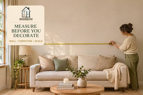
Record the full width of the sofa, bed, console or sideboard. This gives the calculator the visual anchor it needs for sizing.
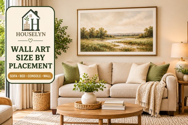
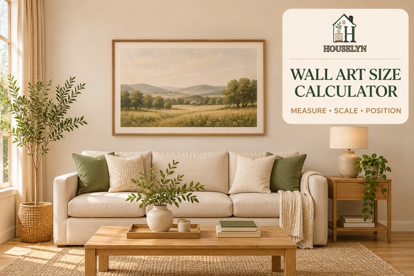
Wall Art Size Calculator decisions become easier when you start with the furniture and wall space the artwork needs to belong to. A beautiful piece can still feel wrong when it is too narrow, positioned too high or visually disconnected from the sofa, bed or console beneath it.
This Houselyn tool helps you turn those relationships into a practical starting size. Measure the space, choose how the art will be arranged and compare a recommendation that respects proportion, placement and the breathing room around it.
 Save This Idea
Start with the furniture or wall section the artwork needs to relate to. Then choose the arrangement and visual scale you prefer. The calculator turns those relationships into a practical recommended artwork width and shows how that scale should sit within the room.
Use the real furniture and usable wall measurements rather than estimating from the full room.
The preview responds to your placement, arrangement and scale choice so you can judge the relationship as well as the number.
—
—
—
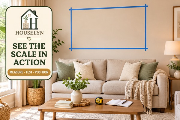
Mark the recommended overall width on the wall with low-tack painter's tape. Step back to your normal viewing position and check that the artwork feels connected to the furniture while leaving enough surrounding wall space to breathe.
Houselyn recommendations are practical starting points. Frame proportions, mats, architectural features and available artwork sizes can affect the final choice.
The Wall Art Size Calculator works best when the measurements reflect the furniture and usable wall area the artwork will actually relate to. A few careful measurements give the result a much stronger visual basis.
Start with the object the artwork needs to connect with. Above a sofa, measure the full sofa width from one outer edge to the other. Above a bed, use the full bed or headboard width. For a console or sideboard, measure the complete furniture width rather than only the open wall behind it.
Next, measure the usable wall width. This is the clear wall area where artwork can realistically sit after allowing for corners, windows, switches, sconces, tall lamps, shelving or other architectural details. The usable wall space matters because a mathematically suitable artwork size can still feel crowded if the surrounding wall is restricted.
Record the full width of the sofa, bed, console or sideboard. This gives the calculator the visual anchor it needs for sizing.
Measure only the wall section that is genuinely available for art, not necessarily the full architectural wall from corner to corner.
Note the clear space above the furniture so the artwork can sit comfortably without crowding shelving, mouldings or ceiling details.
For a blank wall, the wall itself becomes the anchor. Measure the usable width of the section you want to decorate and consider how much surrounding wall you want to leave visible. If you are planning a pair, triptych or grouped arrangement, measure for the complete composition rather than thinking about each frame separately.
Measure the furniture first and the wall second. The strongest artwork placement usually comes from the relationship between the art and the furniture beneath it, not from filling the largest possible section of empty wall.
A recommended artwork width is most useful when you turn it into something you can see on the wall. Before buying a frame, canvas or grouped arrangement, test the footprint in the real room and compare it with the furniture beneath it.
Start by marking the recommended overall artwork width with low-tack painter's tape. If your result is for a pair, triptych or gallery group, mark the outer boundary of the complete composition rather than the size of one individual frame. This gives you a much clearer picture of how the arrangement will relate to the sofa, bed or console.
Use painter's tape to recreate the recommended artwork footprint directly on the wall.
View the taped outline from the position where you normally see the room rather than judging it from directly underneath.
If your recommendation falls between standard frame or canvas sizes, compare the nearest options inside the taped footprint.
Pay attention to the space around the proposed artwork. A recommendation should feel substantial enough to connect with the furniture while still leaving visible wall around the composition. If the nearest standard size is dramatically smaller, the art may lose that connection. If the next size up crowds nearby corners, shelving or architectural details, the smaller option may create the better visual balance.
With a 220 cm sofa, the Houselyn balanced setting places the recommendation around the middle of the established 60–75% furniture-width range. That creates an artwork width of roughly 149 cm, with a useful comparison range of about 132–165 cm.
Marking approximately 149 cm above the sofa lets you see whether the composition has enough presence without overwhelming the available 320 cm wall. You can then compare real artwork sizes against that footprint instead of relying on product photographs or frame dimensions in isolation.
Leave the painter's tape in place for a day and look at it from several positions in the room. A scale that feels appropriate from the sofa may look noticeably different from the doorway or adjoining space.
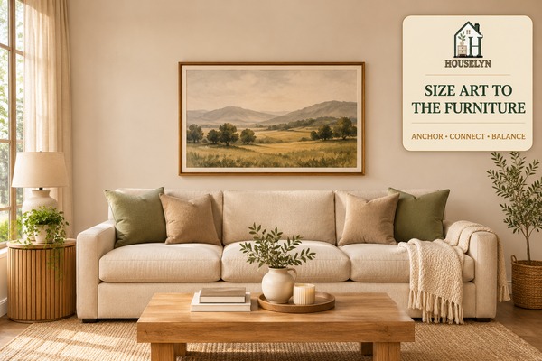
The Wall Art Size Calculator uses furniture scale because artwork above a sofa, bed or console is rarely experienced as an isolated object. The eye reads the artwork and the furniture beneath it as one connected composition.
A large architectural wall can be misleading. If a sofa occupies only part of that wall, sizing the artwork from corner to corner can produce a composition that feels too dominant for the furniture beneath it. The more useful starting point is usually the object that visually anchors the artwork.
That is why sofa width, bed width and console width matter. They create a horizontal reference that helps establish how much artwork the composition can comfortably support. The wall still matters, but mainly as a boundary: it tells you how much surrounding space remains once the artwork has been scaled to the furniture.
When artwork is much too narrow for the furniture, the two elements stop reading as one composition and the wall can still feel unfinished.
A proportionate composition creates enough visual presence to relate clearly to the furniture while leaving comfortable negative space.
Artwork that pushes too far beyond the furniture can overpower the anchor and reduce the breathing room that helps the composition feel calm.
The same principle applies to grouped artwork. A pair, triptych or gallery arrangement should be judged by its complete outer width, not by the dimensions of one frame. When the full composition feels proportionate to the furniture, the individual pieces are more likely to read as one deliberate arrangement.
Negative space completes the relationship. Leaving visible wall around the artwork prevents the composition from colliding visually with curtains, corners, shelving or nearby architecture. Good wall art proportions therefore balance presence with restraint rather than attempting to occupy every available centimetre.
When artwork sits above furniture, ask first whether the two elements feel connected from across the room. A mathematically centred picture can still look wrong if it is centred on the architectural wall instead of the furniture grouping that visually supports it.
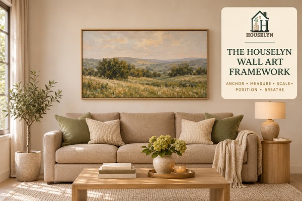
Good wall art placement is not just a question of finding one correct number. The Houselyn Wall Art Framework gives you a repeatable way to judge whether the artwork belongs in the space once size, furniture, placement and surrounding wall area are considered together.
The calculator gives you a practical size range, but the final decision still needs to work visually in the real room. Use the five steps below whenever you are choosing a single artwork, pair, triptych or grouped composition.
Identify what the artwork needs to belong to.
Record the real furniture and usable wall dimensions.
Give the composition enough visual presence to connect.
Place the artwork so it reads with the furniture below.
Preserve enough negative space around the finished composition.
Start by deciding what visually supports the artwork. Above a sofa, bed or console, that furniture is normally the anchor. On a completely blank wall, the usable wall section becomes the reference instead.
Measure the full furniture width and the genuinely available wall area. This keeps the decision grounded in the real room rather than relying on product photographs or estimates.
Size the entire artwork composition so it has enough presence to connect with the anchor. For grouped art, judge the outside footprint of the whole arrangement rather than one individual frame.
Bring the artwork into a clear visual relationship with the furniture. Height, centring and spacing should make the two elements feel deliberately connected rather than independently placed.
Finish by checking the negative space. The artwork needs enough clear wall around it to avoid competing with corners, curtains, shelving, sconces or nearby architectural details.
The furniture anchor, artwork footprint, placement and surrounding negative space should read as one intentional composition. That is why a technically possible artwork size is not always the visually strongest choice.
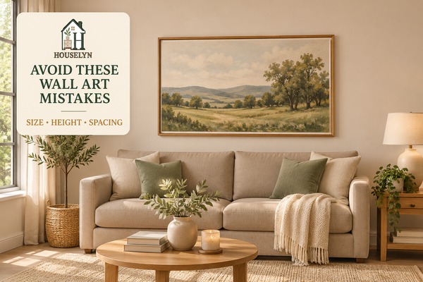
Many artwork placement problems are really proportion problems. A beautiful print can still feel unfinished when the scale, height or spacing prevents it from connecting properly with the furniture and wall around it.
The most common mistake is choosing artwork that is simply too small for the furniture beneath it. A small frame may look substantial when viewed on a product page, but once it is positioned over a wide sofa or king-size bed it can appear isolated. Judge the complete artwork footprint against the furniture anchor before judging the piece alone.
Undersized artwork tends to float above wide furniture rather than creating one connected composition.
Excessive vertical separation makes artwork feel unrelated to the sofa, bed or console it is meant to visually support.
A pair, triptych or gallery wall should be sized by its complete outer footprint, including the spaces between individual frames.
Large gaps weaken the connection between pieces and can make one intentional arrangement look like several unrelated pictures.
Art needs negative space. Crowding corners, curtains or nearby architecture can make even correctly sized artwork feel oversized.
Artwork above furniture often needs to relate to the furniture centre rather than the mathematical centre of the architectural wall.
Mats, frame borders and mounting can increase the final footprint, so compare finished outside dimensions rather than the image size alone.
Buying a smaller artwork because it feels like the safer choice can create the very imbalance you are trying to avoid. Test the calculator's recommended footprint with painter's tape before automatically reducing the size.
The right artwork size depends on what the piece needs to relate to. Above furniture, the furniture usually provides the strongest visual anchor. On an open wall, the usable wall section and surrounding negative space become more important.
Use the calculator when you want a personalised recommendation, then use this wall art size guide as a quick reference when comparing different rooms or placements. The anchor changes, but the Houselyn principle stays the same: artwork should feel connected without crowding the space around it.
| Placement | Primary Anchor | What to Size | Main Consideration |
|---|---|---|---|
| Above Sofa | Sofa width | Total artwork or composition width | Keep the art visually connected to the seating rather than sizing it from the full architectural wall. |
| Above Bed | Bed or headboard width | Single artwork or complete group width | Maintain enough clearance above the headboard while keeping the composition substantial enough for the bed. |
| Above Console | Console or sideboard width | Overall artwork footprint | The art should feel supported by the furniture rather than appearing wider and visually heavier than the console. |
| Blank Wall | Usable wall section | Total composition width | Preserve intentional negative space around the artwork rather than trying to fill the whole wall. |
| Dining Sideboard | Sideboard width | Artwork or grouped composition | Keep the wall art visually centred on the furniture grouping and clear of lamps or tall decorative objects. |
| Fireplace or Mantel | Fireplace or mantel width | Artwork footprint | Respect the architectural centre and leave safe, visually comfortable clearance around the mantel and surround. |
| Hallway or Landing | Usable wall section | Artwork or grouped width | Consider viewing distance and circulation as well as the available wall dimensions. |
For pairs, triptychs and gallery walls, always compare the full outside dimensions of the composition with the relevant anchor. The individual frames may be modest, but once the gaps are included the arrangement can occupy considerably more wall space than expected.
If furniture sits directly beneath the artwork, start with the furniture. If there is no furniture anchor, start with the usable wall section. In both cases, finish by checking the negative space around the complete composition.
These final questions help you move from a recommended artwork width to a confident real-room decision, especially when you are comparing standard frame sizes, grouped arrangements or different placement options.
Continue with the Houselyn guides that support stronger wall balance, better furniture relationships and a more intentional finished room.
Plan the wider wall treatment, artwork footprint, negative space and relationship between wall decor and the furniture below it.
Explore the guide →Strengthen furniture proportion, focal points, visual balance and the way the main elements of the living room work together.
Explore the guide →Improve furniture placement, circulation and visual anchors before using wall art to complete the room.
Explore the guide →Diagnose scale, placement, lighting and visual-weight problems when the finished room still does not feel balanced.
Diagnose the room →Refine the central styling layer so furniture, tabletop details and the wall composition feel connected rather than competitive.
Explore the guide →Check curtain scale and positioning when window treatments share the same visual field as your artwork and furniture.
Explore the guide →
Houselyn's Knowledge Library brings together practical guidance on home decor, room planning, small-space living and organization so each improvement can support the next.
Use these guides and interactive tools to move beyond isolated decorating decisions and build rooms that are comfortable, functional and visually connected.
Houselyn principle: better homes are built through thoughtful decisions, not constant replacement.